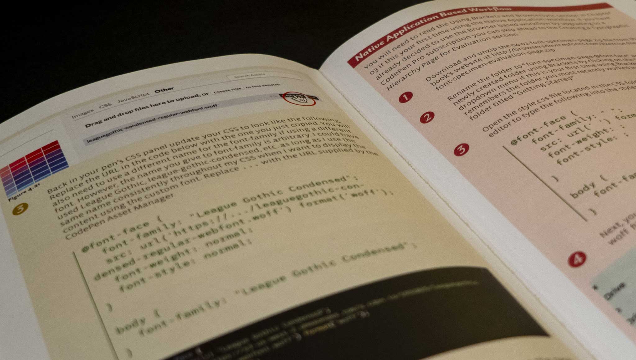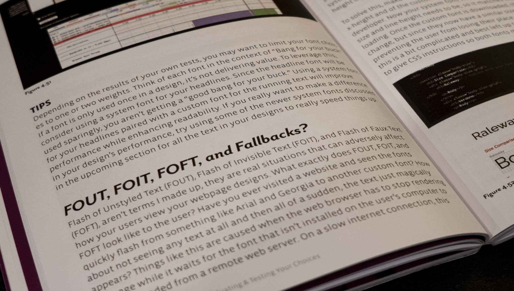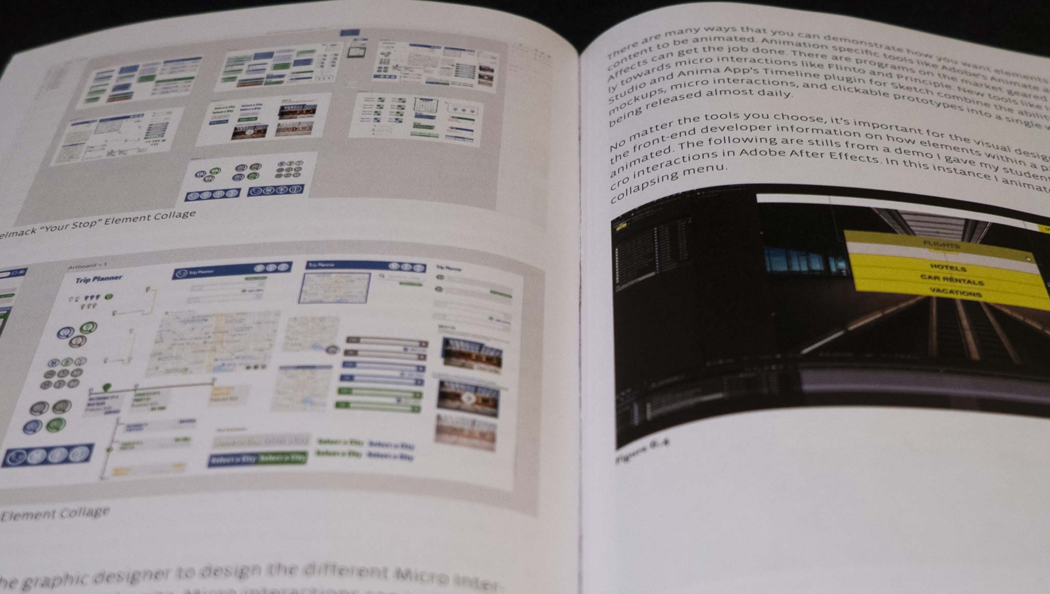


Part technical and part theoretical, Browsers, Devices, & Fonts: A designer’s guide to fonts and how they function on the web, helps designers understand how the typographic choices they make in layout and prototyping programs behave once they are turned into live code. Through a series of demos, this book teaches designers how to create typographic dominant webpages by learning just enough HTML and CSS to be able to view the content in different browsers, devices, and operating systems.
With live webpages to evaluate, designers will learn how to test those pages for supported features and performance, ensuring font choices look as good in the browser as it does in their layout program, delivering a speedy experience to the users.
- Demonstrates the optimal amount of HTML and CSS necessary to create webpages to evaluate typographic choices in the browser.
- Discusses responsive web design and how to evaluate and test those choices for performance and usability prior to front-end development.
- Demonstrates how to review your own typographic, image, and layout choices in the browser through a series of demos.
Resources + Links
Tools
Tools
- Adobe Fonts (Formerly TypeKit)
- Brackets
- Browsersync
- CodePen
- CodePen (Pens listed in the Book)
- Cross Browser Testing
- Google Fonts
- ImageOptim (macOS only)
- JPEG & PNG Stripper (Windows only)
- League of Movable Type
- Node.js
- Performance Test Server
- Web Page Test
Chapter 02
Chapter 02
Footnotes
- Wired.com. 2014. Great Expectations: 47% of Consumers Want a Web Page to Load in 2 Seconds or Less. http://insights.wired.com/profiles/blogs/47-of-consumers-expect-a-web-page-to-load-in-2-seconds-or-less/ (accessed April 22, 2018).
- Eaton, Kit. 2012. How One Second Could Cost Amazon $1.6 Billion In Sales. https://www.fastcompany.com/1825005/how-one-second-could-cost-amazon-16-billion-sales (accessed April 21, 2018).
Chapter 03
Chapter 03
Page 27
- Chrome: The QR Code Extension
- Firefox: QR Code Image
- Opera: QR Box
- Safari: QRify
Page 30
Page 45
Page 49
Page 51
Footnotes
- StatCounter. 2018. Browser Market Share United States Of America. http://gs.statcounter.com/browser-market-share/all/united-states-of-america (accessed July 20, 2018).
- W3 Schools. 2018. Browser Statistics. https://www.w3schools.com/browsers/default.asp (accessed April 21, 2018).
- Hogan, Lara, and Montague, Destiny. 2015. Building a Device Lab. http://buildingadevicelab.com (accessed April 21, 2018).
- Open Device Labs. 2018. Find the right Open Device Lab for your mission and location. https://opendevicelab.com (accessed April 21, 2018).
- thunder::tech. 2018. Digital Marketing Agency & Web Design Firm. https://www.thundertech.com (accessed April 21, 2018).>
- thunder::tech. 2018. User Experience Lab. http://uxlab.thundertech.com (accessed April 21, 2018).
- Meyer, Eric. 2014. Rebeccapurple. https://meyerweb.com/eric/thoughts/2014/06/19/rebeccapurple (accessed April 21, 2018).
Chapter 04
Chapter 04
Page 61
Page 63
Page 64
Page 68
Page 69
Page 70
Page 71
Page 72
Page 74
Page 77
https://codepen.io/browsersdevicesfonts/pen/YLpQZG- https://codepen.io/browsersdevicesfonts/pen/xjRLRd
Page 80
Footnotes
- Sutter, Brian. 2017. Vrooom! Why Website Speed Matters. https://www.entrepreneur.com/article/281986 (accessed April 27, 2018).
- Everts, Tammy. 2016. Google: 53% of mobile users abandon sites that take longer than 3 seconds to load. https://www.soasta.com/blog/google-mobile-web-performance-study/ (accessed April 22, 2018).
- Dunham, Ethan. 2018. Font Squirrel Webfont Generator. https://www.fontsquirrel.com/tools/webfont-generator/ (accessed April 27, 2018).
- Reichenstein, Oliver. 2006. Web Design is 95% Typography. https://ia.net/topics/the-web-is-all-about-typography-period/ (accessed April 22, 2018).
- Scrivens, Paul. 2012. One More Time: Typography is the Foundation of Web Design. https://www.smashingmagazine.com/2012/07/one-more-time-typography-is-the-foundation-of-web-design (accessed April 22, 2018).
- W3C, 2017. Detecting the ambient light level: the light-level feature. https://drafts.csswg.org/mediaqueries-5/#light-level (accessed April 27, 2018).
- Coyier, Chris. 2012. Viewport Sized Typography. https://css-tricks.com/viewport-sized-typography/ (accessed April 23, 2018).
- Shadeed, Ahmad. 2016. Building Resizeable Components with Relative CSS Units. https://css-tricks.com/building-resizeable-components-relative-css-units (accessed April 23, 2018).
- Graham, Geoff. 2017. Fluid Typography. https://css-tricks.com/snippets/css/fluid-typography (accessed April 23, 2018).
Chapter 05
Chapter 05
Page 114
Page 123
- https://codepen.io/browsersdevicesfonts/pen/RyRbwr
- https://codepen.io/browsersdevicesfonts/exercise-files/05-02-layout-evaluation-images.zip
- https:// browsersdevicesfonts.com/exercise-files/05-03-layout-evaluation-template.zip
Page 150
- https://codepen.io/browsersdevicesfonts/pen/ZoOmbd
- https:// browsersdevicesfonts.com/exercise-files/05-04-layout-evaluation-picture-element-demo.zip
Page 162
Footnotes
- W3 Schools. 2018. How TO - Typical Device Breakpoints. https://www.w3schools.com/howto/howto_css_media_query_breakpoints.asp (accessed April 29, 2018).
- Marcotte, Ethan. 2010. Responsive Web Design. https://alistapart.com/article/responsive-web-design (accessed April 27, 2018).
